Friends of the Dublin Library
A NON-PROFIT CASE STUDY
PROTOTYPE
This was a website redesign for a local non-profit. I offered my services as a UX designer after noticing that their website was designed over a decade ago and lacked some functionality.
MY ROLE: End-to-end sole UI/UX designer
Dublin Public Library
BACKGROUND:
Founded in the 1970s, Friends of the Dublin Library (“Friends”) is a non-profit organization committed to supporting and enhancing the Dublin Public Library. Public libraries play an extremely important role in local communities. Research conducted by the American Library Association indicate that public libraries strengthen local economies, encourage healthier lifestyles, and stimulate lifelong learning. Despite the importance of libraries to local communities, however, they are often lacking adequate funding and have even faced the risk of losing funding altogether. For three years in a row, the Trump administration has proposed federal budgets that would have effectively eliminated all public library funding.
Organizations like Friends are essential to keep our libraries strong. Friends singlehandedly sponsors a variety of library programs and events as well as purchases bookcases, display cases, and projectors for the library.
As libraries are very near and dear to my heart (thanks for taking me every week as a child, mom), I reached out to Friends to offer my services in redesigning the existing website.
HIGH-LEVEL OBJECTIVES:
Create new branding, logo for Friends
Refresh website design and layout, increasing clarity and usability
Existing Friends of the Dublin Library Website
For this project, I needed to find out more about Friends itself as well as research comparable non-profit websites.
RESEARCH GOALS:
Identify Friends’ current + future aims, relationship with library and significance of funding.
Identify Friends’ key activities.
Identify what should be included and/or highlighted on the Friends’ website.
Identify how users learn about non-profits.
Identify motivations for non-profit/community involvement.
I decided to use four research methodologies to achieve my goals.
Ongoing booksales by Friends by the entrance of the Dublin Library
1) Stakeholder Interview
First, a stakeholder interview. This helped me learn more about Friends as an organization, its background, and its current and future aims.
KEY TAKEAWAYS:
Friends largely sponsors all library programs and events, including purchasing library infrastructure like bookcases, display cases, and projectors.
Friends’ single most popular event is the semi-annual booksale.
It’s important to make clear what role Friends plays for the Dublin Library.
A goal for the non-profit is to get more people involved.
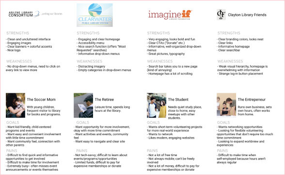
Secondary Research Chart
2) Secondary Research
I explored comparable non-profit websites to determine strengths and weaknesses, and what common UX elements should be included in the Friends website.
KEY TAKEAWAYS:
Engaging images and bright colors look inviting and fun.
Images should be used sparingly; too many with multiple headings look distracting.
Navigation bar should be kept simple and clean, with dropdown to accommodate for additional options.
3) User Surveys
I created a 10-question user survey using SurveyMonkey and recruited participants online.
The most significant takeaway came from the last question, which asked them to rank 5 factors, from most to least important, that would motivate them to get involved in a local non-profit or charity.
22 participants, ranging from ages 18 - 64, took the survey.
KEY TAKEAWAYS:
Tied for #1 as the most important factor were 2 factors: the cause, and the convenience of getting involved.
4) User Interviews
I asked participants questions about their non-profit involvement and library habits. I also asked them to perform a quick usability test on the existing Friends website.
3 participants, ranging from ages 24 - 64, were interviewed.
KEY TAKEAWAYS:
Users generally hear about non-profit involvement opportunities online or through friends/peers; there is huge potential for a fresh Friends website.
There is a general desire to be more involved in the community, but there is an overall lack of motivation or knowledge. The Friends website, therefore, should make it easy, straightforward, and informative.
Now that I conducted my research, I put together three deliverables to organize and contextualize my findings.
First, I created a persona, which is a fictional character that represents my target user. Through my persona, I realized that my target user’s goals and frustrations went hand-in-hand, and that there was opportunity here for my product to help. Elijah, my target user, wants to do more and get involved in “meaningful” (i.e., in causes that are important to him) activities, but, at the same time, he doesn’t know where to start and has trouble summoning the energy to do so.
Next, I put together an empathy map based on the persona, which helped me further understand and organize the problems and mindset of the persona.
Persona (left); Empathy Map (right)
Finally, I drew a storyboard to contextualize how a typical user might use the Friends’ website to solve a problem.
Storyboard and HMW Statement
From my research and my deliverables, I came up with these actionable takeaways and a problem statement:
ACTIONABLE TAKEAWAYS:
Make it easy! Users want to get involved but are lacking the motivation, so make getting involved straightforward and clear.
Emphasize the cause. Users ranked the cause and convenience of getting involved as the two most important motivating factors behind involvement in local non-profits, so make the mission of Friends very apparent.
Keep it simple. Good non-profit websites have engaging and bright imagery, but don’t overdo it. Keep Friends’ homepage simple and to the point, highlighting the important aspects.
PROBLEM STATEMENT:
Elijah needs convenient yet meaningful opportunities to participate within his local community because while he is young and restless, struggling through the familiar monotony of his every day, he has limited time and energy to devote to activities outside of his work and social life.
Now that I had my actionable takeaways and a better understanding of my potential users, I needed to figure out how to organize information and pages within the website in an intuitive way.
Using GlooMaps, I created a site map, which is used to demonstrate relationships between content within the website. This also allows me to think through potential user flows. From my secondary research and stakeholder interview, I concluded that the required pages for the website were fairly straightforward and decided against doing a card-sorting exercise for the sake of saving time.
Site Map
I took a moment here to reflect on Friends’ goals (determined through stakeholder interview), user goals (determined through user surveys and interviews), and technical considerations. I consulted with a software engineer to determine technical considerations.
Putting this together helped me focus during the ideation phase when building wireframes and determining what content to include on each page.
Next, I began ideation for wireframes. After reviewing my research, I determined elements that were crucial to the project goals and to the problem statement: clear navigation tools (navigation bar and search icon), strong branding and mission statement (good hero image and engaging text), and straightforward, enticing involvement opportunities (display, through text or images, these opportunities).
Taking these elements, I started freely sketching out different versions of the significant pages on paper, positioning elements in various ways to see what visually made sense and looked engaging. While I would have liked to sketch out more comprehensive paper wireframes and conduct user testing, time constraints forced me to choose what seemed to be a straightforward design and move on to creating mid-fidelity wireframes in Figma.
Ideation sketches
Mid-Fidelity Wireframes
I relied on my research findings while create these wireframes: I wanted to emphasize the ease of involvement and provide relevant, eye-catching information on the homepage.
One of my objectives for this project was creating a new branding and logo for Friends. Friends currently does not have a logo or any type of branding in place.
First, I started by brainstorming branding adjectives. I came up with a lengthy list, but my main adjectives were:
Pleasant, Supportive, Energetic, Welcoming, Bright, Inviting, Cooperative
Next, I sketched out logo ideas and created high-fidelity iterations of my favorite options. After presenting my logos to a group critique, I decided to go forward with option 5 (below).
Branding Adjectives and Logos
Finally, I put together a final UI style tile with a color palette and typography that reflected my branding adjectives.
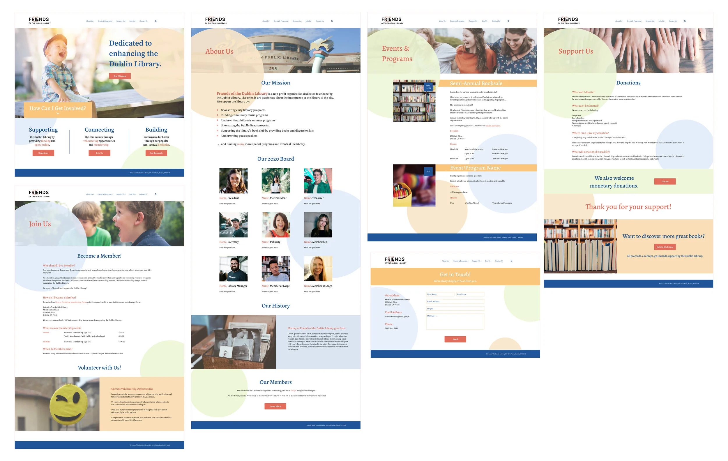
I applied my style tile to the wireframes to create high-fidelity wireframes. I ended up reiterating the layouts of the wireframes and adding other UI elements to better reflect the vibrant, fun feel that I wanted Friends to portray as an organization.
1st iteration of high-fidelity wireframes
These wireframes were then used in the next step, prototyping!
I created an Invision prototype with the high-fidelity wireframes, which I then used in usability testing.
Conducting usability testing
I recruited 5 participants for in-person, moderated usability testing.
I asked them to perform three tasks on the Invision prototype: to find Friends’ mission statement, to determine how to become a member, and to find information about the upcoming semi-annual booksale. These tasks were formulated around Friends’ objectives and prior research findings. I asked participants to think out loud so that I could observe whether they encountered any issues.
HIGH-LEVEL FINDINGS:
100% task completion rate: all users completed assigned tasks
100% error-free rate: all users had no issues or errors
60% of participants expressed confusion over the logo wondering if “Friends” was spelled incorrectly
Using notes from the usability testing, I created an affinity map. This helped me determine successes and pain points to target in reiteration.
ACTIONABLE TAKEAWAYS:
I found that participants were generally successful completing the tasks. The terminology used in the navigation bar and drop-down menus was clear, and all participants expressed that the navigation bar was easy to use and clicked through with accuracy. The CTAs were also successful and eye-catching, and participants used CTAs and navigation bar in equal measure.
I decided to target one specific reiteration based on the usability test.
Logo needs work! Need to make “Friends” clearer.
I based my revisions of the logo on participant comments from the usability test. The goal was to make sure that “Friends” looked clear and readable.
Logo Revisions
Finally, I adjusted colors on some text and background ellipses based on general feedback to add more interest and create a better color balance.
Final reiteration of high-fidelity wireframes
CONCLUSION:
Overall, I learned a lot about non-profit websites. I’ve worked with non-profits before in a legal capacity as a law student and very much enjoyed the experience. Working as a UX designer for a non-profit was definitely different but just as enjoyable. I considered the user’s emotional and psychological state while designing the website because I wanted to get the user actively involved in the organization rather than just drawing them in to the website.
If I had more time and could do things differently, I would have liked to 1) spend more time prototyping at the low- and mid-fidelity stages with user testing, and 2) analyze user traffic on the existing website to see where users most frequently visited. These extra steps would have better informed me as to where to concentrate my efforts and what to highlight on the homepage.
NEXT STEPS:
I presented my redesign to the FoDL board in March of 2020 and received positive feedback. The stakeholders enjoyed the bright colors and welcoming visuals as well as the highlighting of important information on the homepage.
Unfortunately, plans to implement my redesign in conjunction with a volunteer software developer have been indefinitely put on hold due to the pandemic. We’ll hopefully pick this project back up sometime in the future.


