Mirror
AN E-COMMERCE CASE STUDY
PROTOTYPE
This is a project I designed as a UX Academy student for a fictional company called Mirror.
MY ROLE: End-to-end sole UX/UI designer
PROJECT: Mirror responsive website design
BACKGROUND:
Founded in 1994, Mirror is a global chain clothing store with a mission to provide affordable and sustainable clothing for people of all ages and sizes. The company realizes that an increasing number of customers are now shopping online for clothing instead of in brick-and-mortar stores, and it wants to provide its current customers with a more convenient way to shop Mirror’s products as well as appeal to potential customers. Mirror also wants to ensure that Mirror’s signature good service carries over into the e-commerce realm.
HIGH-LEVEL OBJECTIVES:
1. Build an effective and familiar e-commerce website
2. Develop strong branding and logo for Mirror
I needed to get a better grasp on current e-commerce site standards and what users expected and wanted from an online shopping experience.
RESEARCH GOALS:
Identify strengths and weaknesses of existing e-commerce websites.
Identify tiers of user interest in clothing categories or website features to determine what to emphasize or highlight on the website.
Identify general user habits and expectations for online retailers.
I decided to use three research methodologies to achieve my goals.
1) Competitor Research
First, a competitor analysis. This helped me determine the strengths and weaknesses of Mirror’s direct competitors as well as give me an idea of what features should be included on an e-commerce site.
KEY TAKEAWAYS:
Clarity is king; good e-commerce sites have distinct, clearly lineated categories as well as a visible search bar.
Consistent branding is essential; good e-commerce sites have a clear, consistent brand message and logo.
Color as accents; good e-commerce sites aren’t overly distracting or overwhelming.
2) User Surveys
5 out of 5 participants were between ages 23 and 25.
5 out of 5 participants worked in the tech industry.
5 out of 5 participants earned >$100k / year.
5 out of 5 participants spent less than 10% of annual income on clothing, shoes, and accessories.
3) User Interviews
KEY TAKEAWAYS:
COMMON PAIN POINTS —
FIT: 4 out of 5 participants stated that incorrect fit was a major deterrent for shopping online. To make this actionable, provide accurate measurements and fit information for products, and ask returning customers to provide fit information in their reviews.
RETURNS: 4 out of 5 participants stated that inconvenient returns was a major deterrent for shopping online. To make this actionable, emphasize easy returns on Mirror’s homepage and provide clear returns information and returns tracking.
COMMON DESIRES & GOALS —
CONVENIENCE: 5 out of 5 participants find shopping online more convenient with better options. Clearly, there is a huge potential as there is a primed and ready audience to shop Mirror online.
PRICE: 5 out of 5 participants stated that price (good value and/or deals) was a major factor for shopping online. To make this actionable, readily showcase and highlight promotions, sales, and great prices on Mirror’s homepage.
TRUSTWORTHINESS: 5 out of 5 participants indicated the retailer reputation was a significant factor when choosing where to shop online. To make this actionable, display customer reviews and other signifiers of security and transparency.
I synthesized my research findings into three deliverables, which allowed me to view the results in more digestible forms.
First, I created a persona, which is a fictional user who represents a typical user. Creating a persona helped me parse out behavioral patterns in my research and determine common user needs and motivations.
Next, I put together an empathy map based on the persona, which helped me to understand, organize, and communicate the problems and mindset of a typical user in an easily viewable manner.
Finally, I drew a storyboard to contextualize the typical user. It illustrates a narrative that shows my persona experiencing and then solving a problem through Mirror.
Overall, I learned that users are readily primed to shop online rather than in-stores due to the convenience and variety of items, but concerns over accurate fit and fussy returns often deterred them from shopping online. I also found that brand trustworthiness was a significant factor for users seeking to shop online.
Now that I had an understanding of my potential users, I needed to figure out how to organize information within the website in a way that would be intuitive and user-friendly.
I used a remote card-sorting exercise using OptimalSort with 4 participants to see how participants would sort a deck of random clothing items and what categories they would create to organize the items. The results would then inform what clothing categories would be most effective on Mirror’s website.
Interestingly, I found that it was evenly split: two participants organized the items into simple, familiar clothing categories such as “Bottoms,” and “Tops.” The other two participants, however, organized items into styles or outfits such as “Dad outfit,” and “Hillary Clinton on the Weekend.”
From this exercise, I concluded that it would be helpful to organize content on Mirror’s website into familiar, recognizable clothing categories as well as into “Style Guides” and lookbooks.
Site Map
Next, I created a site map with GlooMaps, which is used to demonstrate relationships between content within a product and also allows me to think through potential user flows. I used the site map to map out different categories and pages to include on the website and how they stacked together.
Now, on to ideation and designing the pages!
I started with four rough sketches of the Mirror homepage, keeping in mind prior user research and the card sorting exercise. According to my research, price and retailer trustworthiness were important factors for users shopping online, so I featured sales and Mirror’s mission on a couple of the sketches. Cardsorting also indicated that users may respond well to lookbooks and style guides, so I included the same on the sketches.
Paper Sketches
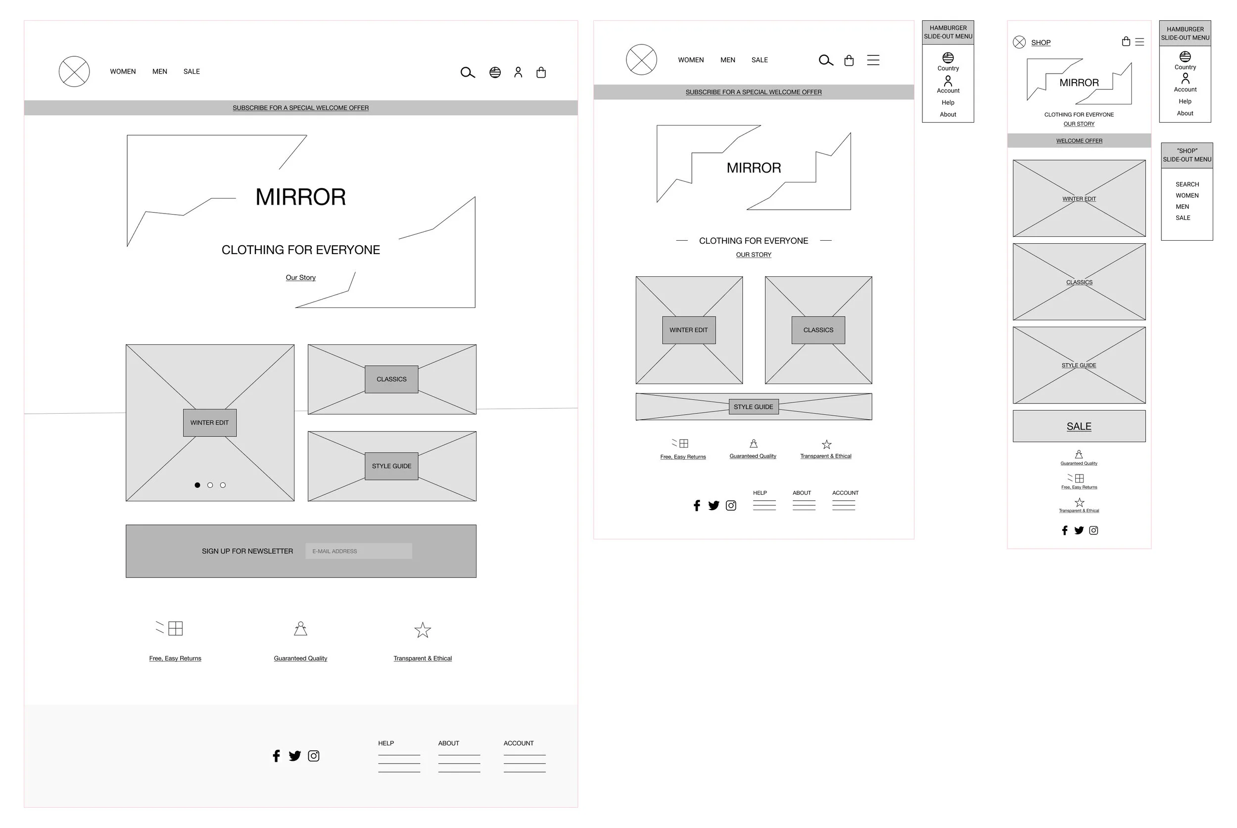
Based on my sketches, I then moved on to creating responsive wireframes for desktop, tablet, and mobile. This allowed me to think through how to structure the homepage across different devices.
Now that I had a basic idea of what to include on the website and how to structure the elements, I moved onto UI design. I created a moodboard and a logo based on brainstormed adjectives that reflected Mirror as a brand. Some of these adjectives included clean, polished, warm, and accessible. I combined all of my visual elements and typography choices into a final style tile to help guide the UI direction when building high-fidelity wireframes.
Next, I created my first high-fidelity wireframes for Mirror’s homepage and a category page using my style tile as a visual reference. At this stage, I referred back to my previous research and deliverables to ensure that what I was including was in accordance with the overall project goals.
1st iteration of high-fidelity wireframes
Based on feedback regarding visual hierarchy, content, and other UI considerations, I reiterated my high-fidelity wireframes several times.
I updated the logo, changed the background color, and resized elements for a better, flowing visual hierarchy. I referred back to Mirror’s mission and prior user research to reinforce my reiteration decisions.
Final reiteration of high-fidelity wireframes
I created high-fidelity wireframes for additional website pages to prepare for upcoming prototyping and usability testing.
Additional high-fidelity wireframes in preparation for prototyping
Now that the final high-fidelity wireframes were completed, it was time to move on to usability testing. I created a test plan and built a prototype using Invision with the completed wireframes.
Three participants were asked to perform three tasks on the prototype: to locate the returns policy, to find a specific pair of jeans, and to browse for and save a sweater to a Wishlist. These tasks were formulated around concerns based on prior user research. I wanted to see how the participants would navigate the website and what problems they may encounter.
I created an affinity map to help organize test findings and determine pain points to target in reiteration. I realized that all of my participants had similar issues with the prototype as well as similar successes.
RESULTS:
100% task completion rate: all participants completed assigned tasks
75% error-free rate: all participants had minor issues/confusion with certain elements
ACTIONABLE FINDINGS:
100% of participants expressed confusion and uncertainty with Wishlist task
33% of participants expressed confusion and uncertainty with color selection
I implemented several changes based on usability testing results.
First, I changed “Save for Later” to “Save for Wishlist.” I also added a feedback element for when users clicks on the heart (saving function) on the broader category page.
Finally, I removed the the drop-down menu when there is only one color and added a color swatch for additional clarity.
CONCLUSION:
Overall, I became more familiar with e-commerce and the elements that users have come to expect from online retailers. The entire process also taught me the importance of keeping branding and user research results at the forefront of the mind while designing. I often found myself getting lost in the design step of the process, blind to the reasoning behind why I was making certain design decisions.
After building a prototype with high-fidelity wireframes, I conducted usability testing and discovered that users faced similar challenges and successes. It was humbling to see that problems I did not foresee arose with regularity, but it was also encouraging as users were generally able to to navigate my site with success.
NEXT STEPS:
Going forward, I would like to re-test my revised prototype to determine whether my revisions eliminated the problems encountered during the first round of usability testing.


